How to hack your Web2App funnel


Why Web2App funnels are the future of mobile growth
Hey everyone, I’m Eugene Strelets 👋 I’ve spent over 10 years building web and mobile-first experiences at companies like Gismart, Loona, Able, and I’m currently at Lovi. Altogether, I’ve launched 500+ experiments across products.
Today, I’m convinced every mobile app dev team should be using Web2App funnels. They’re high-impact, low-hassle, and a secret weapon in today’s privacy-first ecosystem. I’m going to walk you through the best practices, but first… here’s why you absolutely should be using them right now if you’re not already:
- IDFA & privacy changes
With Apple’s ATT and stricter tracking rules, traditional app install campaigns are broken. Web2App funnels let you collect zero-party data on mobile web, so you get better insight and targeting before users even land in your app. - Lower platform fees
Let users pay through web paywalls instead of in-app purchases and sidestep that 15–30% store cut. That alone boosts margins and LTV. - Expanded channel access
Instead of forcing users to install first, you can tap into influencers, native content, SEO, and email. These channels convert better on web, and then you bring users into the app. - Creative & Conversion flexibility
On mobile web, you can test storytelling, personalization, and psychological hooks that you can’t run inside a native onboarding flow. - And here’s the kicker: speed
Want to A/B test a new onboarding flow in your app? That’s a 7-day cycle minimum. Build, QA, submit, wait for Apple to sip their coffee and approve. On the web: launch today, iterate tomorrow. It’s fast, fun, and you’ll never look back.
- You actually get to control billing
On mobile, Apple runs the show when it comes to payments. Want to tweak your billing logic? Offer a grace period? Add a one-time upsell before subscription kicks in? Nope, you’re stuck with what Cupertino gives you.
But with Web2App, billing happens on your turf. That means way more flexibility to experiment, optimize, and tailor payment flows that actually work better for your users and your bottom line. More control means more room to grow.
Alright, now that we’ve covered why Web2App funnels are a must-have, let’s dive into how to build them right so your visitors take the action that matters.
In the next section, I’ll share the exact best‑practice elements your funnel needs from narrative structure to UX triggers to turn curious clicks into loyal users and paying customers.
Step 1: Nail your welcome screen
Goal: Hook the user within the first 3 seconds and lower bounce rate.
The first few seconds after a user lands on your page are critical. This is the moment when first impressions are formed, and unfortunately, when 40% to 60% of users often decide to leave. To combat this high bounce rate, your content must deliver instant relevance and continuity. Users should immediately feel that the page they’re seeing is not only what they expected but also specifically tailored to them, based on their intent or previous action (e.g., the ad or link they clicked on).
Example 1: Age or gender personalization
Insight: Tailored entry points increase engagement by aligning with user identity. What works:
- Segmented choices personalize experience from the start.
- Visual representation matches targeted demographic.
- Headline "Based on your age" creates tailored feel.

Example 2: Loader as first screen
Insight: Loaders introduce the illusion of processing, increasing perceived personalization.

What works:
- Progress bar motivates users to continue.
- Social proof (5-star rating, media mentions) builds trust.
- Fast-paced animation implies personalized result is coming.
Step 2: Trust signals that actually work (no fake reviews needed)
Goal: Warm up cold traffic and confirm product legitimacy.
This content block plays a crucial role in easing those doubts. Your job here is to build trust quickly and validate the product's effectiveness. The most effective way to do that? A blend of social proof, scientific reasoning, and emotional resonance.
In Web2App journeys, this trust-building step becomes even more critical, since users haven’t committed to the app yet, every signal matters.
✅ Example 1: User testimonial

Insight: Peer validation is more persuasive than brand claims.
What works:
- First-person quote and image humanize the product.
- Trustpilot integration adds credibility.
- Soft emotional tone makes the experience feel safe.
✅ Example 2: Scientific proof

Insight: Framing a problem with data builds urgency for the solution.
What works:
- Graph visually explains complex concept.
- Problem framing before solution builds urgency.
- Data validates product approach.
✅ Example 3: Goal Prediction Graph
Insight: Showing the outcome before the commitment increases willingness to convert.

What works:
- Forecast aligns with goal-based thinking.
- Builds emotional anticipation for success.
✅ Example 4: Motivation screen

Insight: Emotional encouragement activates momentum. What works:
- Simple message reassures and supports.
- Friendly visual tone reinforces relatability.
✅ Example 5: Press coverage

Insight: Authority logos trigger fast trust, especially on first touch.
What works:
- Recognizable media coverage lends borrowed credibility.
- Mass adoption statistic reinforces social proof.
Step 3: Personal insight questions
Goal: Drive cognitive commitment through self-assessment.
When users reflect on their goals or behavior, they subconsciously increase buy-in. These prompts also let you personalize downstream logic. Self-assessment tools or reflection prompts tap into this effect. They not only increase engagement and emotional buy-in but also create opportunities to personalize the experience moving forward.

Insight: Asking users to rate themselves invokes introspection and primes future action. What works:
- 1–5 scale is simple but effective.
- Language is self-focused (vs. app-focused).
Step 4: Psychographic segmentation
Goal: Personalize the rest of the funnel and tailor your value prop.
Psychographic data helps you uncover motivation and mindset. It supports customized flows and reinforces product empathy. In Web2App campaigns, understanding a user’s motivation, values, lifestyle, and mindset helps align messaging, product positioning, and experience in a way that feels made just for them. This not only improves conversion rates, but also builds trust and long-term brand affinity.

Insight: People engage more deeply when they feel seen and understood. What works:
- Multi-select format offers freedom and control.
- Categories align with lifestyle aspirations.
Step 5: Keep them hooked while the App loads
Goal: Maintain engagement during pauses with suspense and validation.
Instead of letting drop-off happen while your funnel loads, insert a purposeful loader to build curiosity. But that pause? It’s actually a prime opportunity to deepen engagement. Instead of letting it become a dead zone, use it to build suspense, reinforce value, and increase anticipation for what’s coming next.

Insight: Loaders simulate value being generated, which increases urgency. What works:
- Visual metrics communicate outcome (2x more weight loss).
- A progress bar sustains user patience.
Step 6: Summary of insights
Goal: Reflect the user’s journey and confirm progress.
A good summary screen helps solidify belief in the product and justifies what’s coming next (like a paywall). When designed right, this screen reinforces the user’s progress, makes the experience feel personally meaningful, and sets up the next step as a logical and even exciting move forward.

Insight: Repetition of user input reinforces ownership and personalization. What works:
- Results recap looks credible and insightful.
- Use of diagnostic language makes output feel premium.
Step 7: The “Aha!” Moment
Goal: Deliver a magical, personalized transformation insight.
This is the funnel climax. It should feel personal, futuristic, and satisfying. Now it’s time to reward that investment with something that feels deeply personal, a bit futuristic, and undeniably satisfying. This is the “Aha moment”, the moment users say: “Wow, this is exactly what I need”. Done right, this moment creates a powerful emotional "yes", paving the way for conversion, purchase, or deeper engagement.
Insight: A good scan moment can increase downstream paywall conversion by 30–50%.
What works:
- Instructional sequence sets expectations.
- AI-scan or facial mapping enhances novelty.
- Interaction makes the user feel “seen.”


Step 8: Use this last screen to lock in the win
Goal: Delay the reveal with expectation-building animation.
This is the final inhale before the pitch. Instead of rushing to the next screen, use this micro-moment of suspense to build curiosity and emotionally prime the user for what comes next, whether it's a product offer, personalized plan, or subscription page.
Insight: Pauses are powerful if they feel purposeful.
What works:
- Checklist interface boosts perceived value.
- Social proof testimonial builds legitimacy

Step 9: Email capture
Goal: Offer personalized results via email as an added benefit.
In Web2App journeys, an email gate should feel like a service, not a toll. Offer value in exchange for trust.

Insight: Reframing email capture as a delivery tool improves opt-in by up to 40%.
What works:
- Simple design minimizes drop-off.
- Clear benefit: “See My Results.”
- Legal transparency builds trust.
Step 10: Paywall best practices
Goal: Convert emotionally primed users into paying subscribers.
Your paywall is the moment of truth, the final handoff from emotional investment to financial commitment. It should give users a sense of unlocking something valuable, like they’ve earned access to the good stuff.
Example 1: Visual transformation preview

Insight: Future pacing (showing user outcome) increases intent to act.
What works:
- Visual side-by-side makes the journey tangible.
- Stats like "Body fat: High → Advanced" quantify change.
- Countdown timer adds urgency to the decision.
Example 2: Pricing Plan Selector

Insight: Anchoring discounts with urgency boosts commitment.
What works:
- Promo code and timer add scarcity.
- Plan comparison encourages upsell to longer tiers.
- Daily price breakdown lowers friction.
Example 3: Plan highlights

Insight: Bullet-point summaries support fast-scanning users.
What works:
- Easy-to-skim icons.
- Clear, specific benefits with action verbs.
Example 4: FAQ section

Insight: Directly addressing objections improves conversion confidence.
What works:
- Expandable FAQ format reduces clutter.
- Answers offer reassurance and reduce ambiguity.
Example 5: Social proof

Insight: Reviews serve as decision accelerators.
What works:
- Relatable tone from real users.
- Emphasizes transformation and value-for-money.
Example 6: Risk reversal

Insight: Removing fear of loss increases the likelihood to buy.
What works:
- Specific guarantee timeline (“30-day”).
- Refund policy transparency.
You’ve built the funnel. Now make it smarter
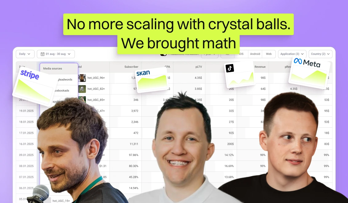
Building a killer Web2App funnel is half the battle. The other half? Knowing what’s really working.That’s where Campaignswell comes in. It helps you forecast ROI, spot the best-performing creatives, and scale confidently without wasting weeks (or budgets).
One team scaled their ad spend from $65K to $600K per day while keeping ROI steady at 50%+ because our real-time predictions showed them which experiments would pay off before the budget was burned.
Ready to see it in action?Book a demo and let’s dive in.

Co-founder & CEO at Campaignswell
Book a demo


Co-founder at Campaignswell
Use the session to ask your hardest questions about scaling, LTV, or attribution, and see how full-funnel predictive analytics gives you clear, actionable answers.
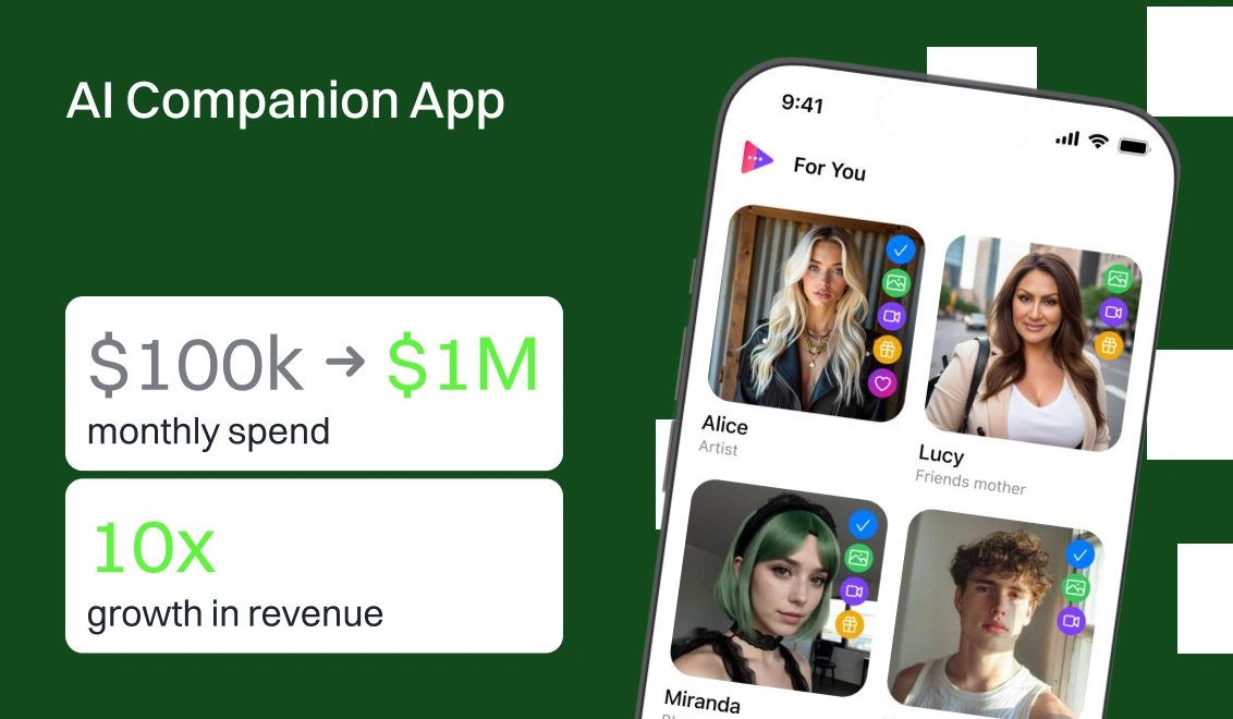
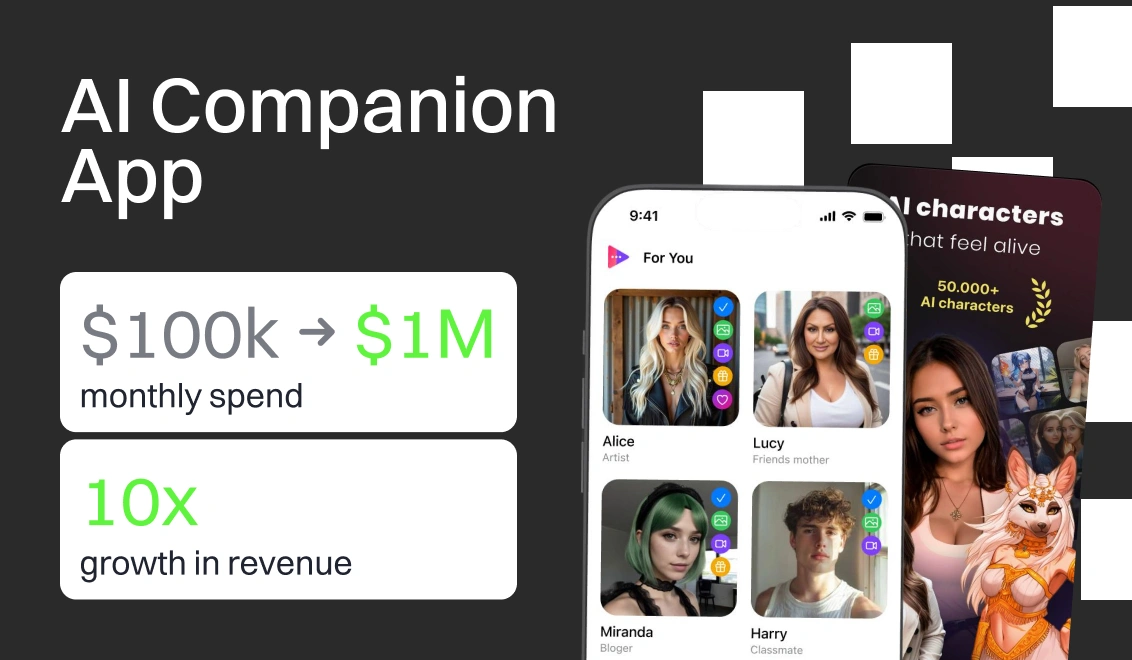
Why your Subscription App can’t break the $100K/Month ceiling without losing revenue


71 takeaways mobile app publishers can use to improve monetization strategy and LTV
10 monetization mistakes that hold back subscription apps