User acquisition strategy guide: how to read dashboards without getting lost in metrics


It starts the same way every time: dashboard open, coffee in hand, scanning the numbers. The charts are crisp, the columns neatly aligned, the story seemingly straightforward. CPA looks fine, ROAS isn’t sounding alarms. Yet beneath the calm surface, something stirs — a sense that the real story is hiding just out of sight.
Ernest Lebedev, senior User Acquisition manager at Almus, knows this all too well. He’s steered campaigns through the fast and tangled currents of the Chinese ad ecosystem — OceanEngine, Kuaishou, Tencent, and beyond. Even with that depth of experience, he’s faced numbers dressed up as wins that, in reality, spelled trouble. The kind of moment that feels like a crying-cat meme brought to life.
On a parallel path, Artsiom Kazimirchuk, co-founder of Campaignswell and a mathematician by training, has spent his career peeling back the polished surface of fintech and mobile growth data. He’s seen dashboards mask chaos under clean visuals and tidy graphs and decided to build tools that cut through the noise to the truth.
When these two dig into dashboards, they bring war stories, not hypotheticals. The lessons they’ve distilled come from budgets on the line, campaigns at scale, and the hard-earned clarity that comes only after the numbers have been tested against reality.
This article distills that clarity into something you can act on. You’ll learn how to read metrics with sharper eyes, how to sidestep the traps that bleed budgets, and how to make your dashboard a tool for momentum.

The purpose of dashboards in user acquisition strategy
Artsiom calls an effective dashboard a “powerful table that helps businesses grow.” The real value of a dashboard shows up when the numbers and charts guide your next move. For UA teams, that means linking marketing actions to outcomes: should you scale, pause, or tweak a campaign? Where’s the spend actually earning revenue? Where are the leaks?
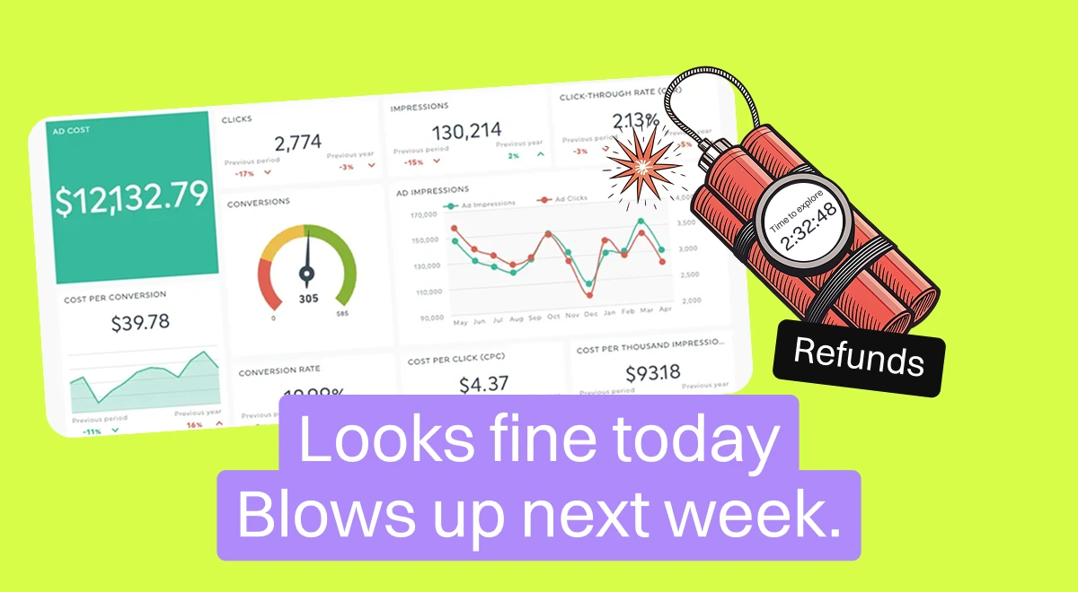
But here’s the catch: the entire system rests on data integrity. One corrupted feed and the whole dashboard tells the wrong story. Ernest recalls a case where backend glitches inflated purchase events sent into Facebook. The platform showed a cheerful CPA of $10, while the real cost was closer to $40. Why the mismatch? Because Facebook isn’t in charge of verifying payments or subscriptions, it only repeats what your backend feeds it. In this case, instead of 25 real payments, the system mistakenly sent 100. Facebook divided the $1,000 spend by 100 and served back a $10 CPA. The truth was $1,000 divided by 25: a $40 CPA. On paper, it looked like a win. In reality, it was a money pit. Teams scaled based on that illusion, only to discover weeks later that 75 percent of their supposed revenue was fake. By then, the damage was done. Ernest calls this one of the most painful traps, because it encourages scaling just when you should be hitting pause. Artsiom’s antidote is blunt: take revenue “directly from the producer,” whether that’s Apple, Google, Stripe, or another source, and process it intelligently to minimize mistakes.
The second challenge is understanding that what shows up in dashboards is processed data, not raw truth. Models shape the outputs, smoothing over some details and exaggerating others. Ernest insists that UA managers need to know those underlying models, or they’ll end up making decisions on sand.
What really stands behind user acquisition metrics
Behind every metric is a story that isn’t as solid as it looks. As Ernest explained, what we often call “fact metrics” are not pure facts at all. They’re estimates, because we can’t take a single ad, show it to eight billion people, and measure the exact conversion rate. Instead, dashboards approximate reality through sampling, aggregation, and modeling.
Metrics also live like people: they go to work every day. Open your dashboard on Monday and you’ll see one number. On Tuesday, it shifts. By Friday, it’s moved again. These fluctuations are the natural rhythm of data in motion. The key is knowing which changes are noise and which are signal.
Standard deviation helps you draw that line. If trial-to-pay conversion hovers around 10.3% and drops to 9.9%, that sits comfortably inside the expected band. No reason to panic. But if the same metric climbs steadily to 12% and holds there for three days, that’s a flag worth raising. It suggests something changed, maybe a new onboarding flow or a paywall test, and now you have a story to investigate.
Statistical significance is your reality check. Metrics move all the time, but without enough volume, you can’t know whether the movement is meaningful. Ernest emphasized that big shifts on tiny samples are often illusions. Only with proper significance can you claim that a drop or rise reflects actual user behavior.
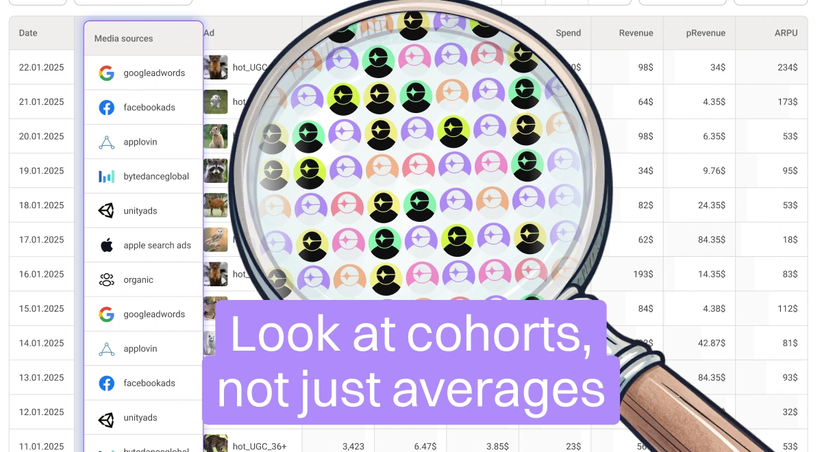
Dashboards also love to show averages of averages. It looks neat, but it’s misleading. Ernest recalls campaigns where one geo was printing money while another was bleeding cash. Rolled up together, the blended average looked stable, lulling the team into a false sense of security. Only by slicing the data by source, OS, country, or payment method did the true picture come into focus.
Then there are the event correlations. A sudden lift in conversion may be linked to something obvious, like launching a new onboarding flow. But sometimes, as Artyom notes, nothing in your product or marketing changed at all. The spike came from outside: maybe a competitor dumped millions into ads, maybe Apple featured an app in the store. Without aligning events with metric movement, teams risk chasing ghosts.
And don’t forget delayed effects. Refund rates, for instance, rarely appear the same day as a payment. They can spike weeks later, changing the real shape of a cohort’s value. Predictive metrics are prone to the same lag. A model might call a cohort profitable early on, but only by comparing predictions against actuals over time will you know if the forecast holds.
Real-world data lives its own life. Some metrics wiggle without meaning, others reveal turning points in your business. The craft is learning to spot the difference to know when a drop is just noise, when a rise is worth celebrating, and when an average is hiding a fight between winners and losers beneath the surface.
[[cta1]]
Common mistakes in user acquisition dashboards (and how to spot them)
Inside the Numbers
The average that lies
A blended number can look neat but hide chaos. Take cost per install across all campaigns: one geo might be crushing it while another is bleeding money, yet the average looks “healthy.”
How to catch it: Slice your data by media source, country, OS. BI dashboards often default to “averages of averages,” so you only see the truth when you zoom in.
When normal fluctuations cause panic
Metrics move. A trial-to-pay conversion that shifts from 10.3% to 9.9% feels like a drop, but often it’s just natural noise.
How to catch it: Run a standard deviation check in Google Sheets (or your tool of choice). It tells you whether the dip is real or just day-to-day wiggle. Most small swings are harmless.
Fake comfort from corrupted data
Platforms like Facebook don’t calculate your revenue, they echo what your backend sends. If your system mistakenly sends 100 purchases when only 25 happened, a $1,000 spend shows a $10 CPA instead of the real $40. That illusion invites overspending fast.
How to catch it: Always reconcile platform data with payment systems like Stripe, Apple, or Google Play. Raw revenue never lies.
Inside the Mind
Old playbooks don’t always work
Just because a strategy worked last quarter doesn’t mean it works now. Markets shift, products change, users behave differently.
How to catch it: Treat every “winning tactic” as a fresh hypothesis. Run the test, check significance, and only then decide it’s still valid.
Jumping to fast conclusions
It’s easy to pin a drop in conversions on your UA campaign, but sometimes the real culprit is elsewhere, like a new product flow slowing users down.
How to catch it: Break numbers down by cohort, source, or OS before assigning blame. Dig, don’t guess.
Dashboard logic gone wrong
Dashboards sometimes recycle logic from older products. That can make predictions like LTV look inflated, say, applying the behavior of one app’s users to a brand new one.
How to catch it: Compare predictive metrics (like pLTV) to fact metrics (like actual cost per paying user). If they don’t align, rethink the model.
When teams don’t talk
Numbers can mislead if context is missing. Imagine conversions dropping right after the product team quietly tweaks the onboarding flow. Without knowing that, the UA team blames campaigns and makes the wrong move.
How to catch it: Keep the loop tight. Sync with product and BI teams so you know what’s changing under the hood.
The smart way to read UA dashboard metrics for a winning customer acquisition strategy
Understanding the mechanics behind metrics is one thing. Reading them in a way that leads to the right decision is another. This is where Ernest and Artyom’s hard-won playbook comes in.
1. Ground-truth everything. Don’t trust ad platforms to calculate revenue. Cross-check against your payment processors. If Facebook says CPA is $10 but Stripe shows otherwise, you know where the truth lives.
2. Segment first, then read. Never rely on blended dashboards. Break performance down by geo, OS, channel, creative, and cohort. That’s where the real story hides.
3. Map metrics to funnels. Don’t look at conversion rates in isolation. Align them with the actual steps users take through your funnel, so you can see exactly where drop-offs occur.
4. Align events with timelines. When metrics shift, map them against product launches, onboarding changes, or creative swaps. Sometimes the answer is obvious once you line things up.
5. Watch for competitor effects. A sudden drop may have nothing to do with you. Big players entering the market with massive spend can warp your metrics overnight.
6. Read predictive metrics carefully. Use pLTV, pROAS, and SAC, but always compare predictions with actuals over time. Adjust your models if they consistently over- or under-estimate reality.
7. Don’t stop at CTR. Creative diagnostics go deeper than click rates. Look at the downstream impact, do high CTR ads actually convert into long-term value, or just cheap clicks?
8. Build lag-awareness. Some metrics (like refund rates) reveal themselves only weeks later. Factor those into your early decisions to avoid scaling into a trap.
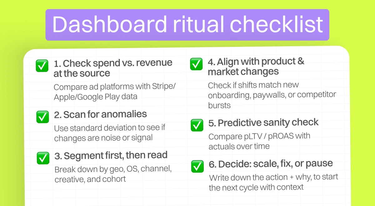
9. Make it a ritual. Start a 10-minute daily reading process: check spend vs revenue at the source, scan for anomalies with standard deviation, segment by key dimensions, and align any shifts with known events. Then decide: scale, fix, or pause.
A dashboard shifts every day, and that movement is what makes it valuable. Some numbers act like steady landmarks, others hint at fresh patterns taking shape. Seen as a living system, the data reveals its own rhythm, transitions, and unexpected turns. Reading it this way builds clarity and the kind of decisions that push strategy forward with confidence.
When metrics meet reality: user acquisition case studies
Example 1: paywall change in the Chinese market
Ernest Lebedev shared a real-world case from the Chinese market. His team removed a three-day trial and introduced a no-trial subscription, while also raising the upfront price. On the dashboard, cost per paying user immediately went up which looked alarming at first glance. But predictive LTV climbed as well, ROI held steady, and in the end, overall profitability improved compared to the trial model.
The surface metric (CPP) looked “awful,” yet in context it was the right move and a smart long-term decision. This example highlights why UA teams should never judge metrics in isolation. Seeing only CPP would suggest failure, but looking at the full funnel and predictive models told the real story: the change was a win.
Subscription model performance (China case study)
Example 2: user behavior impacting ROI
In another case, campaign-level numbers looked stable — CTR, install rate, trial and paid conversions all held their shape, yet ROI kept sliding. When the team segmented cohorts, the problem emerged: users were dropping off faster than before. The root causes varied. Sometimes it was media source changes, sometimes a product glitch, like onboarding videos loading too slowly in certain regions. When every cohort shows the same decline at once, it often points to a product-wide issue rather than a marketing misstep. The tables below illustrate this shift: CPP increased, but the higher pLTV balanced it out, keeping ROI stable and ultimately boosting revenue.
Turning dashboard metrics into action: the UA decision-making process
A good read of the dashboard turns into progress only when it flows through a clear loop. The loop is simple, repeatable, and grounded in the same principles Ernest and Artyom walked through.
1) Start with the whole picture
Anchor on source-of-truth revenue from Apple, Google Play, Stripe or Paddle, then read performance in BI across the full funnel and by segment. Use cohorts, countries, OS, sources, campaigns, creatives, and payment methods. Blends stay in the background until slices are clear.
2) Form a hypothesis with context
Write a short statement tying a proposed action to an expected metric movement. Examples from the session included paywall adjustments, onboarding tweaks, creative rotations, geo launches, and bidding changes. Link the hypothesis to the key ratios you will watch and the cohort window you will use.
3) Set guardrails before touching spend
Define the bands for natural fluctuation with rolling averages and standard deviation. Add a minimum sample size and a significance check for the primary ratio.
4) When the test runs, clean data streams are critical
Corrupted or inflated events can send teams in the wrong direction, as seen in the Facebook CPA example where fake payments suggested profitability that didn’t exist. Keeping logs of changes and syncing product and marketing actions prevents chasing false stories in the data.
5) Reassess from multiple angles
Evaluate the same period through several lenses. Look at step-through rates across the funnel, compare cohorts by acquisition date, and reconcile platform reports with payment data. Map metric movement to the change log and to external events such as featuring, competitor bursts, or market shifts.
6) Some effects only appear later
Refund rates, for instance, often spike weeks after payments, reshaping ROI. Predictive metrics may also drift over time, so comparing forecasts with actual outcomes remains part of the loop.
7) Decide and record the next move
Scale when the metric holds steady outside its variance band on enough volume, fix when a funnel stage is underperforming, or pause when refund-adjusted ROI falls below the floor. The key is writing down what was decided and why, so the next cycle starts with context.
8) Repeat the loop
The value comes from rhythm. A short written hypothesis, a clean run, a multi-angle read, and a clear decision. Then the next iteration.
Unlocking predictive metrics: your UA dashboard’s new superpower for sharpening customer acquisition strategy
With Campaignswell, you get both real and predictive metrics on a single dashboard. Because our models are built on actual user behavior, not dead averages, the predictions reach over 90% accuracy. That gives UA teams the confidence to scale spend by tens of times without losing ROI, just like many of our clients already do (you can read their stories here).
<highlight-green>Looking for the same solid ground to scale on?<highlight-green>
Book a demo and we’ll show you how it works.
Your dashboard can’t predict. Ours can.

Co-founder & CEO at Campaignswell
Book a demo


Co-founder at Campaignswell
Use the session to ask your hardest questions about scaling, LTV, or attribution, and see how full-funnel predictive analytics gives you clear, actionable answers.


Why your Subscription App can’t break the $100K/Month ceiling without losing revenue


71 takeaways mobile app publishers can use to improve monetization strategy and LTV


10 monetization mistakes that hold back subscription apps